Planning a Strategy
The most important step we take first…
Here we discuss the job your website needs to do for you.
Most times it needs to do more than one job — our discussions will sort these in order of priority and how they can best be carried out.
We will pay particular attention to your audience and the best methods to reach them on-line. And when we reach them, how to welcome them to your brand as warmly as possible.
Believe it or not, this initial stage if often missed out — but it is the most crucial.
Armed with this valuable information we know who your customer is and how to appeal to them. We also know the course of direction your website should be taking.
You know those websites, that just sit there, like driftwood in the ocean and not making any money? It’s because this stage is missed out.
Page mapping
Next we’ll map out the required pages and the information we need on each page.
This gives a clear sense of purpose to each page and creates an early form of navigation.
And on each page, we’ll arrange its content in order of importance — this believe it or not, is the beginnings of your design…
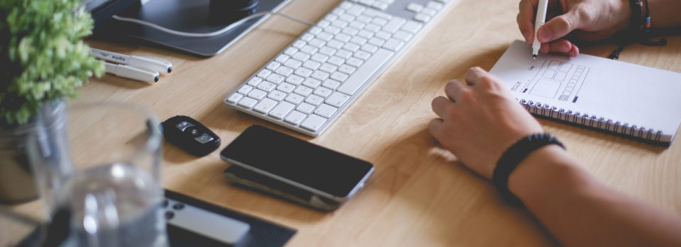
Wireframing
Armed with the pages required and the content they have to contain, our next step is to develop the templates we need for your website.
Templates form how we organise your content on a page.
A wireframe is essentially a ‘skeleton’ of your web-page. It shows how and where to display your content.
Is is purposely, stripped of design. As a rule of thumb, we don’t want elements such as branding, colors, and styles to influence us just yet.
Once this stage is complete, we have the foundation of a great website in our hands. We have…
- A good hierarchy of content
- Strong navigation to help your user find the information they need
- And a solid template system to deliver your content in a coherent and easy-to-digest manner.
A good template system is also key when scaling your website – whether you have 5 or 5,000 pages – your upkeep will be exactly the same.
Design Atmosphere
It is safe to say web design has changed over the last few years. This due to the massive rise of web traffic originating from mobile devices such as iPhones and iPads.
In fact, mobile traffic accounts for around 50% of all web traffic.
As a result, it’s difficult to predict the size of screen used by someone viewing your website. It is also impossible to whether they’re viewing with a zippy broadband or a clunky 3G mobile connection.
So not only do we need to consider how your website displays on a tiny mobile screen, we also need to ensure it is ‘light’ enough to download quickly.
You would think this makes the design process quite complicated and tiresome…
Actually, it’s not. Moreover, it’s much more fun too. 🙂
This is possible due to the previous steps we will have taken. Knowing what’s important on each page makes ‘mobile-first’ design much simpler.
We do need to change our design approach a bit though — so gone are the days of ‘static Photoshop comps’.
We now focus on creating a design atmosphere with you.
A ‘Design Atmosphere’ is a ‘look-and-feel’ direction (colour, texture and typography).
We’ll be using a combination of Photoshop visuals, mood boards, and live code on a development website.
When creating our design, we will be focusing on what will be appealing to your customer.
We will be using tried and tested design techniques to make your pages convert better. A typical example being to lead a user’s eye to your ‘Buy Now’ button.
We will also look at ways strengthen your brand and to differentiate ourselves from your competition.
Build Process
We start the actual build on a live development domain. This will be a live website (restricted from search engines) where you can visit at at anytime. In fact, we encourage to visit and provide feedback often.
The benefits, of this approach, to you is massive.
You get to see your website evolve before your very eyes, and you can see exactly what it will look like across a variety of devices.
This stage of the build often overlaps with the previous ‘Design Atmosphere’ stage.
Its conclusion is a living, breathing version of your future live website. You’ll get to see exactly what your website not only looks like but feels like before launch.
Admin-Side Optimisation
Great, so we now have a lovely website for your users but what about your website from your perspective?
Your website has to be easy for you to add pages, design elements (emaill option forms for example) and edit content too.
This is another example of where we go that extra mile for you. 🙂
There are many ways we can make the admin-side of your website a nicer experience for you. These include but aren’t limited too…
- Add a new webpage or blog post, easily.
- An optimised WYSIWYG text editor. If you can use Microsoft Word you can use this — no need to know HTML.
- We can custom code nice little boxes for you to add ‘aside content’ such as testimonials, videos, and sign-up boxes.
- We can even add specific easy to follow instructions (text or video) for you — emebed within the page admin area, where you need it.
Your website will work at its best when it is regularly updated with content. We make this easy for you to do.
Launch
After a final round of spell-checking and an all-over once-over, we get your site launched.
We ensure it’s hooked up to any third-party services such as email management systems (e.g. Mailchimp) and Social Media channels.
You’re now the proud owner of a highly optimised website. It began its life destined to target your customers with laser-like precision. It now gets to do its job.
For many clients, this not the end, it is in fact, the start of our journey together…
We’re sure you’ll love your experience with us!
So, Let’s Go!…
Alternatively, check out our Pricing and Packages.